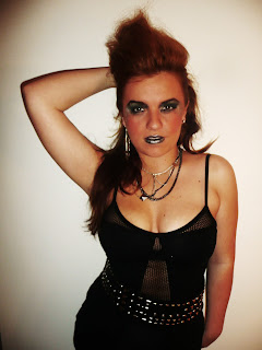
This is my finished double page spread. i have kept the same article but just completely changed the layout and used different pictures to make a collage effect and to go with the fact the article is about Mileys life then and now. i like this better as it looks neat and and it flows better and is more easy for the readers to read.
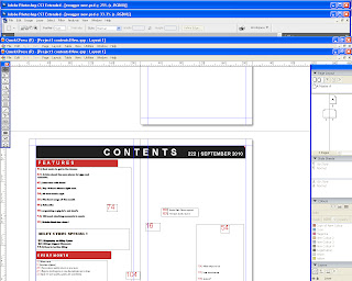
In this screenshot it shows how i used text boxes around the picture box in the middle, as this is were my photo is going. I made the boxes fit around the picture so that there would be a neat layout and there would be a flow of words easy to read.
In this second screenshot you can see i have added the title and i have used a quote from Miley Cyrus to engage the readers and get them interested in the article.
Here i have added the picture onto the bio and i have chosen this picture because it goes with the headline of the quote from Miley.
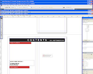
This is my final screenshot and this shows the finished product and how i have put it all together and also added more text to engage the reader and give a sneak preview of what they can exspect to find.


