Thursday, 31 March 2011
Wednesday, 9 March 2011
Tuesday, 8 March 2011
Monday, 7 March 2011
Thursday, 3 March 2011
Thursday, 20 January 2011
Screen Grabs for double page spread.
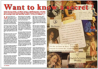
This is my finished double page spread. i have kept the same article but just completely changed the layout and used different pictures to make a collage effect and to go with the fact the article is about Mileys life then and now. i like this better as it looks neat and and it flows better and is more easy for the readers to read.
In this screenshot it shows how i used text boxes around the picture box in the middle, as this is were my photo is going. I made the boxes fit around the picture so that there would be a neat layout and there would be a flow of words easy to read.
In this second screenshot you can see i have added the title and i have used a quote from Miley Cyrus to engage the readers and get them interested in the article.
Here i have added the picture onto the bio and i have chosen this picture because it goes with the headline of the quote from Miley.
This is my final screenshot and this shows the finished product and how i have put it all together and also added more text to engage the reader and give a sneak preview of what they can exspect to find.
Friday, 14 January 2011
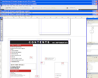
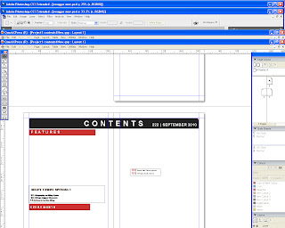
Screen Grabs from contents page
This is my final contents and i have made it more neater and gave it a better structure than all the others.
i also added more content and added a small picture of the front cover of swagger.
i have added pictures to it and made it eye catching and easy to read so the pages can be located easily through the choice of the reader.
I then added page numbers of were the photoes would go and made sure all my page numbers and headings were placed in order and looked good.
I then added blocks of colour to go with my magazine front cover and continue the same colour scheme throughout. i also added more text and positioned it around untill i was happy.
This is my contents page and i have started with a template of a double page, i then added text boxes and put them in the order of whats most popular, for example features, exclusive etc.
Tuesday, 11 January 2011
Screen grabs from Front cover.
This is my final product. i have
changed it a few time but i finally think that this is
the best one and looks the most professional and unique out them all.
Sunday, 2 January 2011
Miley Cyrus Bio Pics
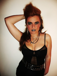
These photoes were not used for my article about Miley Cyrus in the end because they didnt work well. so instead i used these for other content in the magazine and for the article i used a collage of pictures of miley to make a better look to match the article.
These are my pictures i took for my biography of miley cyrus for my magazine.

This is the photo i have chosen to use for my Miley Cyrus biography. It shows how shes into jewlerry and alot of black and it also goes with the headline of my biography "I am not very good at keeping secrets at all! If you want your secret kept do not tell me!" because the fingers our on there lips as if to say the quote from Miley.
These are my pictures i took for my biography of miley cyrus for my magazine.

These are pictures from the internet to show you how mine are similar.
This is the photo i have chosen to use for my Miley Cyrus biography. It shows how shes into jewlerry and alot of black and it also goes with the headline of my biography "I am not very good at keeping secrets at all! If you want your secret kept do not tell me!" because the fingers our on there lips as if to say the quote from Miley.
Subscribe to:
Comments (Atom)


